Our goal with this assessment was to research a typeface family of our choosing from one of the serif or sans serif type families and construct a poster to hang in an exhibition celebrating type. Our submission must engage our audience in a new and exciting way. It must also express a solid idea, inform and show our typographic skills.
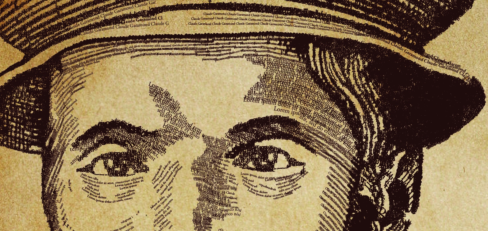
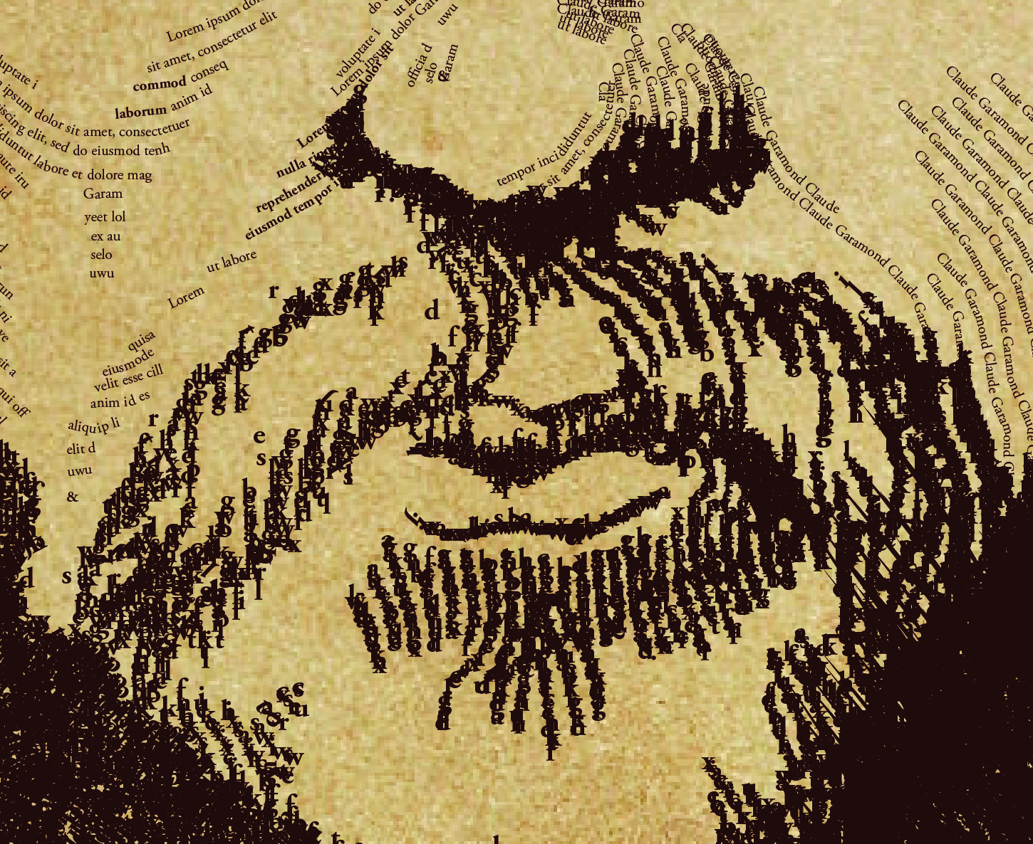
I feel the use of contrast, positioning and scale make the whole project stand out. Claude Garamond was one of the first independent punchcutters who specialized in type design. His career was literally type!
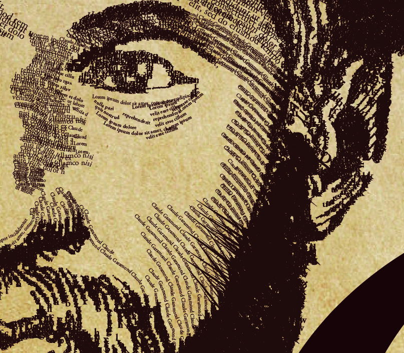
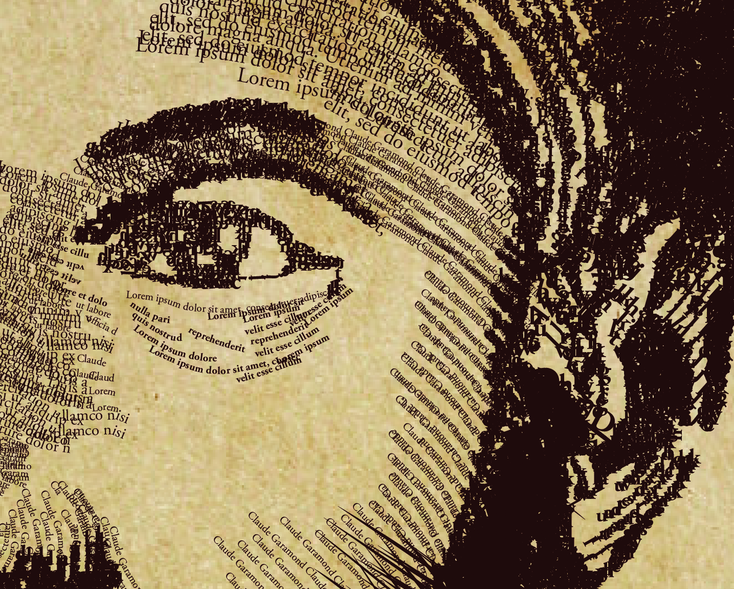
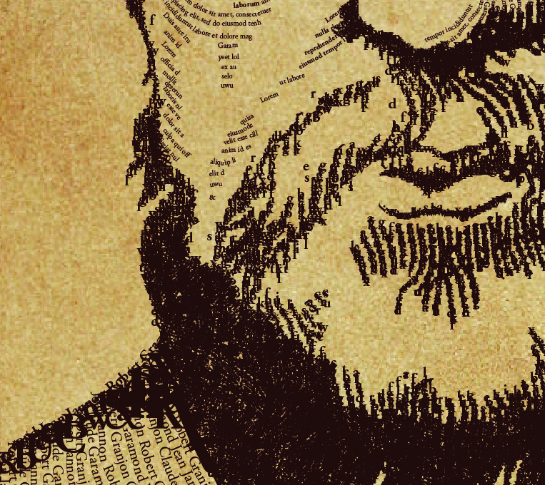
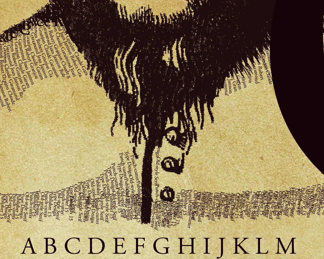
I wanted to emphasize that in this design using type. I also wanted to bring a level of complexity to the design. The more you look, the more you see and if you look close enough you can find words like Claude Garamond, Type Design, Old-style Serif & Punch-cutter along with other contributors to the Garamond Typeface such as Jean Jannon and Robert Granjon.
I ended up employing the use of negative space to the right of the portrait as well as opting to relocate text inside the G. Doing so also promotes direction in a way. When you first look at the poster, the portrait is the first thing you see. Your eye then crosses the page towards the G and ‘Est 1540’ then below to the traditional layout which is another point worth discussing.
The Garamond Typeface has truly withstood the sands of time and continues to be utilized to this day. A felt a more traditional layout to a type specimen poster was therefore more appropriate here. We can see alignment here to the left for the Alphabet, and to the right for the quote, and typeface styles.
Ideally I would like to print the design on a vintage, aged paper to bring in more texture to the design and I plan on doing so if time allows me. I also would like to see if I can print this at a larger size such as A1 to bring out those smaller details in the portrait.
